Latina Sans – a work in progress
Type design
Ana Galatanu
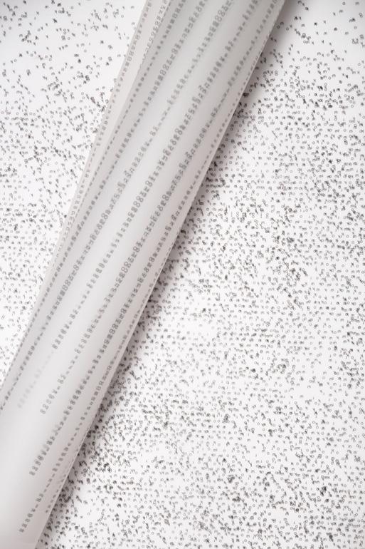
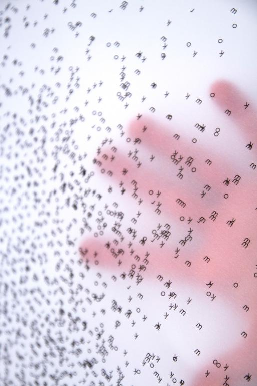
The idea of the project was to create a constructivist, yet legible type-family to celebrate Bauhaus. But designing a typeface in 6 weeks it’s not a good idea. What seemed reasonable as I enrolled in this project, ended up in long working hours of fixing mistakes, learning to see and pushing points back and forth. Every feedback and read helped me improve, but took time: letter design, diacritics, spacing and kerning. In the end, the process became part of the result itself, by being translated into a series of posters printed on thin, transparent paper, that emulates the layers of the software. Latina Sans is a work in progress until the type-family will be completed.